
In this month’s blog, I explore my experiences and reality through how I use colors and psychology. However, I won’t approach it scientifically; instead, I’ll try to explain how colors and psychology exist inside my artistic creation processes. At times, it will seem like I drift between the themes of colors and psychology—and at times I do—but my entire explanation of how color impacts my techniques and results must involve my main partner in creation: music.
The Fusion of Color & Sound
Color and music are powerful communication tools that signal action, influence mood, and even influence psychological reactions. Emotions are the glue that connects all the elements together.
Every song has a color and emotion attached to it.
Every color has an emotion and sound attached to it.
Therefore, music and color go hand in hand. They have been this way all my life, which is likely why I’m both an artist and a musician. Most of the time when I experience music, I see colors; it’s an internal response that I can’t control called Synesthesia. Music-Color Synesthesia is a rare, neurological phenomenon that happens when someone listening to music automatically experiences many colors and emotions.
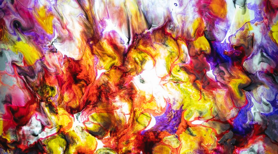
As a musician and artist, I use music and colors regardless of whether I create either. Often, I see dynamic sounds and moods in colors when I play or write music, while the opposite occurs when I create art. The colors and overall feel of each piece are established from the music I use when listening or making a piece. To demonstrate this concept, I’ll start with the music creation angle.
When I use or create music, different notes and melodies are used to create the sounds. At the same time, I follow a visual color path that I see internally whether my eyes are open or not. Synesthesia doesn’t interfere with my sight and isn’t hallucinogenic; rather, the colors just float there in a way you may imagine a memory. While I don’t need to close my eyes, it helps me visualize the colors and psychology behind the music better if I do.
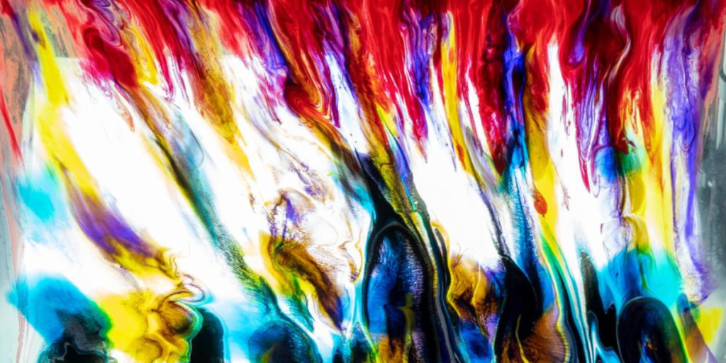
Likewise, I use music when I create art to establish a color pallet. This means I choose and use colors whose emotional associations fit the emotional colors and psychology of the music I’m playing. During this process, I use a variety of techniques to create my pours, with the most common approaches being:
- Using music to physically manipulate and transport the paints.
- This process occurs through either:
- Using an entire album or song with gravity to create an entire piece.
- Using dynamic parts of songs to create certain elements or characteristics within a pour.
- This process occurs through either:
- Using only gravity to manipulate or transport paint, but not music.
- In this scenario, music is still critical to the creation process, as it helps:
- Establish my mindset and mood.
- The environment and overall vibe of my workspace
- Colors being used.
- The “dynamics” or characteristics that appear in a piece.
- In this scenario, music is still critical to the creation process, as it helps:
What’s interesting is that different art pieces which use the same songs rarely look alike. I attribute this effect to whatever musical element I’m focusing on at the time—it could be a bass line, drum pattern, or simply an energy. Because the music’s dynamics don’t change, some shared characteristics appear, however I don’t always see the same colors for each song. For example, I’ve done several pours to “Hey Baby” by Jimi Hendrix. While the final pieces shared some common characteristics, they were overall different, proving how subjective the colors and psychology of music can be.
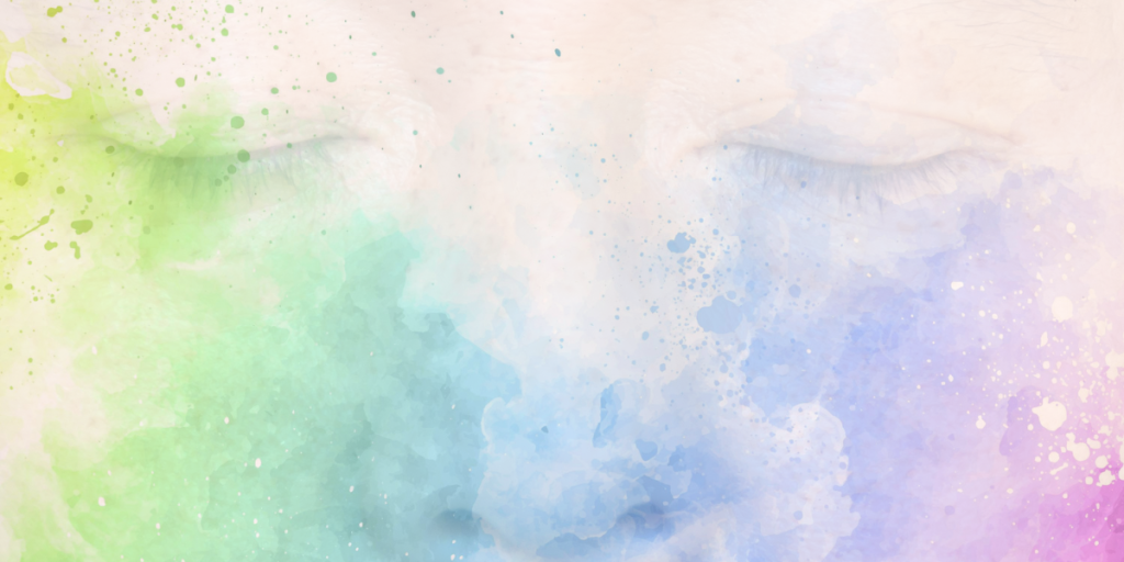
Universal Colors and Psychological Emotions
Reactions to colors are rooted in psychological effects, biological conditioning, and cultural imprinting. Culture creates some differences, but overall colors and psychology have a universal symbolic meaning. Let’s look at a few examples.
- Red: Passion, excitement, love
- Pink: Soft, reserved, earthy
- Purple: Mysterious, noble, glamorous
- Blue: Wisdom, reason, peace
- Green: Nature, growth, freshness
- Yellow: Hope, joy, danger
- Orange: Warmth, kindness, joy
- White: Truth, indifference, pure
- Black: Noble, mysterious, cold
How different colors affect emotions depends mainly on a color’s brightness, shade, tint, or whether it’s cool or warm-toned. Below are a few examples of how colors can affect how you feel:
Warm colors
Red, orange, and yellow are all warm colors. These colors often evoke psychological feelings of happiness, optimism, and energy. These colors can also have an attention-grabbing effect, signaling danger or evoking action (i.e., stop signs, hazard warnings, and barrier tape).
Cool colors
Green, blue, and purple are cool colors. These colors usually create calming or soothing effects but can also express sadness. Purple is often used to help spark creativity as it combines blue (calm) and red (intense).
Happy colors
Bright and pastel warm colors can also have an uplifting psychological effect on your mood. The brighter and lighter the color, the happier and more optimistic it will make you feel. Colors also create happiness by combining primary or secondary colors for a youthful, vibrant effect.
Sad colors
The colors and psychology of sadness are typically dark and muted. Grey is the quintessential color of sadness, however other cool colors like blue, green, or neutrals like brown or beige similarly drop a person’s emotions.
Calming colors
Cool colors like blue and green can make you feel calm. Cool-toned pastels—like baby blue, lilac, and mint—are calming and relaxing. Neutral colors like white, beige, and light grey can also make you feel calm. The more straightforward and fewer colors you combine in your design, the more calming the piece will feel.
Energizing colors
Intense and bright neon colors can create powerful psychological emotions. Bright red, bright yellow, and neon green can feel energizing, which will make you more alert but may be hard on the eyes. These colors will stand out from your surroundings. Highly pigmented, intense colors like royal blue, turquoise, magenta, and emerald green can also stimulate your senses to make you feel refreshed or energized.
That’s all I’ve got in me for now. I hope you enjoy reading these and learn something new about the colors and psychology behind my artistic process.
Until next time, stay safe and well.
Jelly